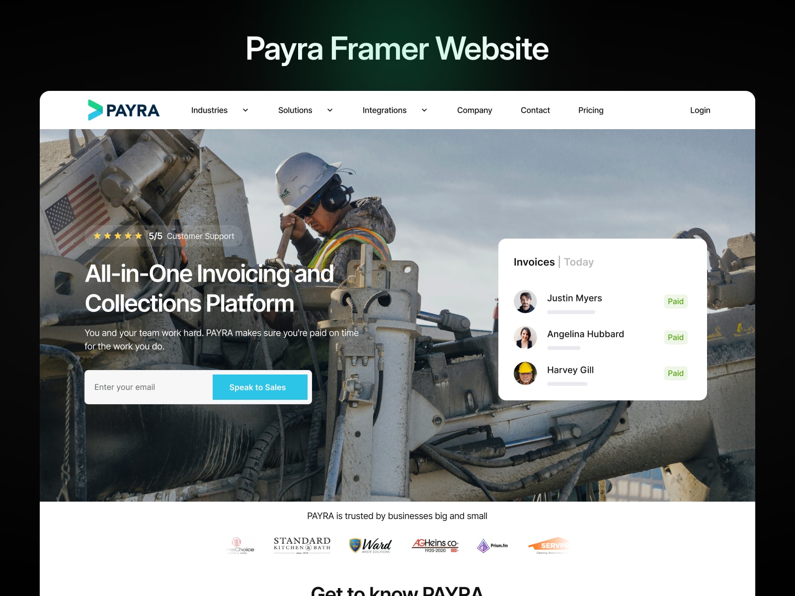
Overview
Payra, a growing platform in its industry, approached me to enhance their website’s performance and usability. With a significant portion of their users accessing the platform via mobile devices, the need for a faster, more mobile-responsive site was critical.
Challenges
- Slow Load Times: The website's existing structure and assets were not optimized, leading to delays in loading pages.
- Mobile Responsiveness: The site lacked consistency in its design and functionality across various screen sizes, particularly on mobile devices.
Objectives
- Reduce website load times to improve user retention and experience.
- Ensure the website functions seamlessly and looks visually appealing on all devices.
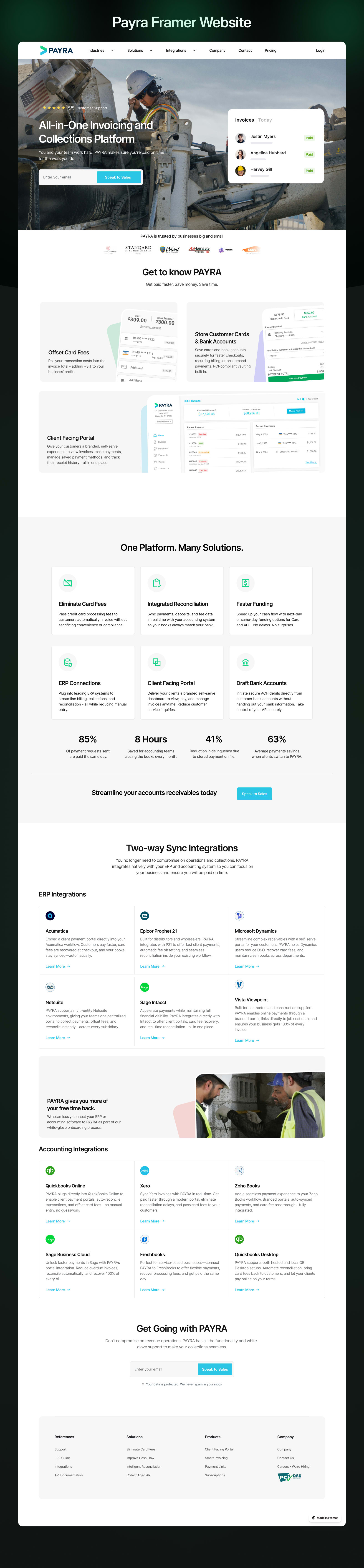 Full page · scroll
Approach
- Performance Optimization:
- Audited the website to identify bottlenecks, such as large uncompressed images, excessive scripts, and redundant code.
- Compressed and optimized media assets to improve loading speeds.
- Implemented lazy loading for images and other non-critical elements.
- Mobile Responsiveness:
- Reviewed the existing design for adaptability to different screen sizes.
- Adjusted layouts, typography, and interactive elements to ensure usability on smaller devices.
- Conducted thorough testing across a range of devices to confirm consistency and performance.
- Collaboration:
- Worked closely with Payra’s development and design teams to align improvements with the brand's vision and technical infrastructure.
Results
- 50% Faster Load Times: Optimizations significantly reduced page loading times, providing a smoother experience for users.
- Enhanced Mobile Experience: Mobile bounce rates decreased by 35%, indicating improved usability and engagement.
- Positive Feedback: Users reported a noticeable improvement in the website’s performance and responsiveness.